The Cult of Beauty: An Extraordinary Era – Behind the Scenes of the Autumn/Winter collections

August 6, 2012

‘Autumn/Winter is a season dripping with lush colour and lavish detail’ – British Vogue

Edwardian opulence meets modern edge as Smythson steps into the new season with a powerful palette of earthy, olive tones, coupled with bursts of violet or crimson. Colours are deep, textures rich, and design indulges every detail. As our collections slip into their autumnal hues, their styles shift to mix and match your every move and mood. Go all-in with a capacious Cooper tote in violet ostrich, or give your day-to-evening look a kick of contemporary flair with our versatile new range of Mara accessories.

Keeping an eye on form and a hand on functionality, our designers turned to the era of Smythson’s birth for inspiration, looking at the interconnected impacts of art and culture that transformed British society at the turn of the century.

‘One should either be a work of art, or wear a work of art.’

Oscar Wilde.

Legendary icon of elegance, eloquence and unapologetic extravagance, Wilde was a champion of the Aesthetic Movement, one of Britain’s most   compelling cultural periods of creativity.

When drawing inspiration for Smythson’s Autumn/Winter collections, our design team looked to “The Cult of Beauty”, the hit 2011 exhibition at London’s Victoria & Albert Museum which paid tribute to the celebration of decadent, tactile and sensuous beauty that was ushered in with the birth of the Aesthetic Movement in the 1860s.

The movement in Britain counted artists, writers and poets among its founders, including the painters Dante Gabriel Rosetti and Frederic Leighton and textile designer, writer and artist William Morris.


Described as an ‘expression of taste and cultivation’, it called for an acknowledgment of the importance of art in everyday life, emerging from the materialism of the Victorian age to find a new, liberated kind of beauty. At its heart was an exultant celebration of form and colour, leading to a cult of creative and intellectual hedonism which was driven by the notion of ‘art for art’s sake’.


William Morris’ Green Dining Room at the Victoria & Albert Museum

Smythson’s head of design notes that it was the V&A’s Green Dining Room, created by Morris’ design firm in 1865, that provided the autumn collection’s starting point:

‘We were struck by the room’s breadth of scale and intricacy of detail, a powerful composition which very much resonated with the philosophical thread that runs throughout the Smythson brand.  Its rich, green-stained oak panels and layers of texture, patterns and stained glass conjured up forest-like images of green foliage, creating the basis for our colour palette and what we felt was a much-needed return to a more sophisticated kind of luxury.’

Explore the new collections here.

An Extraordinary Window into the World of Kerry Lemon

May 29, 2012

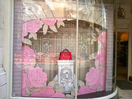
In celebration of Her Majesty the Queen’s 2012 Diamond Jubilee, we commissioned charming illustrator and artist Kerry Lemon to create a quintessentially British installation with a twist for our store windows.

We invited her in to share her inspirations and tell us how she will be celebrating the Jubilee this weekend. During the interview, her simple, direct turn of phrase and humble, quirky humour belied the exquisite intricacy of detail in her drawings, illustrating why she was the perfect partner for our royal tribute.

Kerry’s easy, open manner brimmed with all the irreverent dynamism that shines through in the fresh, bold lines of her work. Sitting down she smiled, settled into her chair and cupped her hands around a mug of tea.

Having initially drawn inspiration from The Wallace Collection, and the graphics and colours of London photography volume This Is London, we commissioned Kerry for her inimitable style and ability to capture the essence of all things British; from churches and cathedrals to seaside scenes and flowers. Her drawings of roses in particular brought an added element of fantasy to the concept.

 Using the staged photography style of high society and royal court photographer Cecil Beaton as a key reference, we devised a ‘pinhole theatre’ concept, and thought this was the perfect fit for collaboration with Kerry.

Kerry: “I think the creative brief and my own illustration style met so naturally, the colour scheme of soft pink and sepia tones was lovely. I thought the vintage-inspired blend of sepias and pinks was really pretty.”


Q: What was it about Smythson that made you want to work with us?

 “It was definitely the craftsmanship that attracted me to Smythson, the exquisite attention to detail in the design and play with texture of your products. As soon as I read the proposal, I thought ‘This is amazing, I have to do this!’  It’s such a cool project, because it enables me to use my drawings on a massive scale which is so exciting. I also unashamedly love the Royals, so the fact that I was able to draw crowns and Buckingham Palace is just dreamy!

“It was a really fun project to work on, everyone knew exactly what they wanted and it was a very clear brief – they’d done mood boards, which I love! And then I could go off and play with my ideas.”

Kerry’s illustrations for our windows

Q: Tell us a bit about yourself

“I’m an illustrator and an artist, most of my work is editorial – I draw pictures for magazines, book covers and album sleeves. I originally studied Fine Art, which involved lots of installations in large spaces. I used to find a space I liked which could be the corner of a room or a ceiling, out of which I would create something sculptural.” Kerry beamed and flung her arms wide to illustrate her point, “I’m 4”10, so I like working on a big scale!

“My background in installation art has been really helpful, because I’m not intimidated by scale and it makes me think quite differently to other illustrators. After finishing my degree, I received a Queen Elizabeth’s Scholarship, QEST, to which artists and craftspeople can apply to further their studies. I was given a grant and I then went on to study illustration at Cambridge. I then set up my illustration business, with a three year business plan like proper geek!”

Q: How did you start working on window installations?

“My first commission came about when I was approached by Electrum Gallery on South Molton Street, who asked me to hand-paint their window. I said no initially because I thought “Oh crikey, no way, that sounds too scary”, but I was eventually persuaded and I loved it. I loved the interplay with people when they came past to see how I was getting on, it opened up the process in a really refreshing way and I thought ‘I want more of this!’. I’m inspired by the notion of taking something as simple as a sketch and launching it into extraordinary new dimensions by recreating it on a huge, interactive scale.”


Q: You’ve worked for institutions such as The Times, Liberty and The National Trust. What do you think it is about your drawings that appeal to British brands like us?

“My illustrations are relatively traditional, but also a bit quirky! They’re clearly hand-drawn rather than computer-based, so there’s a real craftsmanship involved which I think resonates with a brand like Smythson. I draw everything by hand, I love drawing – I’m obsessed with it!”

Q: Where do you draw your inspiration from?

“I try and take Fridays out of the studio to go and draw. I love to draw in museums, the British Museum is amazing and the V&A is great to draw in.  In every collection, there’ll be something that really inspires me, for example I recently went to see Howard Hodgkin’s collection of Indian Paintings at the Ashmolean Museum in Oxford, and I cannot stop thinking about the colours. There was a really beautiful hot pink and a mint shade which I loved, and the compositions and level of endless detail was amazing, you could even borrow magnifying glasses!

“I try and go on drawing trips every year, this time I’m going to the Orkneys and Iceland, last year I went to Wales and Finland.  All I want to do is draw! I come back with sketch books full of colour. Finland was really green – it’s amazing, and the colours of the houses were a particular kind of rusty red that I would never normally use.”

Q: What would be your dream commission? If you could draw absolutely anything, what would it be?

“Drawing Buckingham Palace was one, so thank you Smythson! I love to work with architecture, nature and animals. When left to my own devices, I could draw anything.  At the minute, I’m obsessed with flowers and using a lot of gold and copper leaf and gloss paint.

“I get commissions to draw all sorts – typewriters one week, shoes the next – that’s why having my personal sketch books and scrapbooks to flick through matters so much, it means I can play with composition and themes for inspiration and ideas.”

Q: Tell us about where you work.

“My studio is at home in Virginia Water in Surrey and it’s really peaceful, there are birds, it’s green, it’s lovely.

“There are banners hanging from the ceiling and the walls are covered in quite crackers stuff! For example, today I went to do some brass rubbings in the crypt of St Martin’s- in- the- Fields that’ll go up in the studio. I drew a crazy knight in different colours – I liked the pattern of his chainmail, I’m really attracted to patterns.”

Q: And finally, how will you be celebrating the Jubilee?

“If I could celebrate in any way, I think a giant house party with girlfriends would be my choice, as I’m such a fan of dressing up! We’d make our own crowns and tiaras with lots of red, white and blue fabric and safety pins for ridiculously festive, patriotic gowns. There would also be gallons of tea, cakes, scones and pink lemonade!”

Images of Kerry Lemon: © Clare Kelly: www.cargocollective.com/clarecatherinekelly


Susie Lau: Delving into Smythson’s Archives

April 2, 2012

As our heritage timeline launches on Facebook, we open up the Smythson archives to guest blogger Susie Lau of Style Bubble

Delving into Smythson’s archive material is a potent reminder of gentler times, when a Christmas card would contain messages such as “May Christmas bring you many a kiss and never a tear or a sigh”.  I’m not personally one to go riding waves of nostalgia, but it is lovely to know that such a time existed when you’d wish for someone that they never experience tears or sighing without a shade of irony.

I also love a time when invitations to a dinner party or a wedding were incredibly small, with this specimen here on the left measuring about 7cm x 5cm.

The Smythson story is a simple one that started in 1887 when Frank Smythson opened his first shop at 133 New Bond Street.  Initially, Smythson worked in the silversmith trade but turned his hand to luxury stationery for the well-to-do.   The well-kept scrap books reveal a fastidious character, with every Smythson bit of memorabilia preserved and neatly organised.

The more interesting thing about Smythson was that whilst they primarily made stationery, they also offered other little trinkets that ranged from the conventional to the very quirky indeed.

Jewellery seems like a natural link to Frank Smythson’s silversmith beginnings.

A combined bag, hand muff and cushion looks like a product worth reviving today.

A “Victoria” housewife’s kit is nothing out of the norm of the early 20th century.

However a sardine/sandwich server and a suffragette-themed novelty pepper dispenser are the slightly odder offerings from this book of presents.

Smythson’s handiwork can really be seen in the stationery that was created for the Indian Maharajas during the early 20th century.  I especially love the mother of pearl surfaces that can be seen in the embossed emblems.

I had to chuckle at the sheer frivolity of this card which invited people to fly to the Prince of Jodhpur’s sherry and cocktails ‘do.

I copped a feel of the first ever Smythson ‘Panama’ diary, created in 1908 which was a real innovation of Frank Smythson because of the super thin paper used as well as the flexible lambskin used for the cover.

These bijoux sized notepads continued on into the 1920s and spawned some really fascinating gender-aimed notebooks.  There’s some vaguely sound advice in both books.  For instance, a man is told to “Choose a woman with your ears not your eyes” and women are reassured that “He is a fool who thinks by force or skill, To turn the current of a woman’s will.”  It’s difficult not to be charmed by the quaint aspect of these notebooks.

At London Fashion Week autumn/winter ’12

February 23, 2012

From attending the Jonathan Saunders and Erdem a/w ’12 shows to spotting Smythson handbags and notebooks looking chic on the front row, here are our highlights from London Fashion Week autumn/winter ’12

The finale at one of London Fashion Week’s opening shows, Corrie Nielsen a/w ’12.

We spotted Liberty London Girl Sasha Wilkins looking chic in one of the key shades of s/s ’12.

Shop our Rose collection here.

At the BFC tents wearing the new Antonia and Rose collection iPad case.

The colour-blocked Cooper shoulder bag in turquoise.

Smythson invitations to the Jonathan Saunders autumn/winter ’12 show.

The amazing view from the nineteenth floor of Broadgate Tower, the Saunders show venue.

Stylist and Fashion Editor Laura Fantacci wore her Emily shoulder bag and shared her London Fashion Week wardrobe on her daily blog, Wearing It Today.

At Erdem autumn/winter ’12 held at the White Cube Gallery in Bermondsey.

Harper’s Bazaar’s Sarah Bailey at Erdem using her Runway Notes book and Nancy Tote.

And Vogue’s Emily Sheffield spotted looking stylish with the Emily East/West Zip Tote.

At London Fashion Week: Jonathan Saunders autumn/winter ’12

February 21, 2012

We attended our collaborator & BFC/Vogue Designer Fashion Fund winner Jonathan Saunders’ autumn/winter ’12 show at East London’s Broadgate Tower on Sunday evening…

The Smythson invitations complete with tissue-lined envelopes.

The amazing view from the nineteenth floor of East London’s Broadgate Tower, the show venue.

The show finale – a ladylike, equestrian-inspired collection of patterns, texture and a palette of colour-blocked brown, reds, greens and sky blues.

And we spotted some Smythson at the after party:

Our PR Manager, Casey York wearing the Cooper in turquosie.

Jonathan Saunders’ PA, Sophia wearing a Smythson Sling.

And British Vogue’s Emily Sheffield wearing her Emily East/West Zip Tote.

Fashion Week Windows…

February 16, 2012

London Fashion Week begins tomorrow and we’ve installed our latest windows to celebrate, featuring every editor’s essential, our Runway Notes book alongside spring/summer ’12 Cooper and Emily handbags.


Our Visual Merchandiser, Marco,  shares the inspiration behind the display:

The theme of our new windows is “timeless elegance with a modern twist” expressed through the classic architectural structure of columns painted matt white to give a modern, artistic feel. Certain columns are tilted, bringing a kinetic surrealism to the display.

Light plays a very important role in this scheme, diffusing a soft and delicate mood. Spot lights are aimed on to the product in order to give a theatrical feel to the ensemble, especially at night-time.


Susie’s Valentine: Amour Sans Fin

February 7, 2012

Guest blogger Susie Lau gives her take on the limited edition Valentine’s range and explores the inspiration behind it, our company archive…

Valentine’s Day is a double headache for me as my other half’s birthday also happens to fall on the same day.  Is it Valentine’s Day or Birthday first?  I’ve normally gone for the latter given that the day your significant other was born is ever so slightly more important than a holiday honouring a Christain saint.

Still, I can be persuaded otherwise to switch allegiance over to V-day especially after investigating the new Valentine’s collection by Smythson.  Entitled “Love Through the Ages”, the collection is inspired by a page from this early 1900s Smythson catalogue.  I was surprised to discover that the Smythson product range back then was curiously expansive – everything from bronze statues of cockerels to handbags to jewellery were available to the Smythson customer.

A page of motto charms was where Smythson found the words “Amour Sans Fin” which now graces a gold charm that comes with all nine pieces from the classic red lizard print leather range.

I especially love this photo envelope which is a beautiful way of holding treasured prints.   The idea of an envelope clutch purely for the purpose of holding a photo or two is a decadent one but I suppose it is all part of the indulgent spirit of the holiday.

Ditto for this sweet little trinket box which comes with a chocolate leather heart nestled inside.  It’s not edible but it can be stamped with the message of your choice.  Again the singular purpose of this trinket box is pretty hard to resist but it’s the dinky size that really is the winning plus point.

There are some truly horrific Valentine’s cards about, the sort that are so cringeworthy, you can’t imagine actually giving it to someone you liked, let alone your most beloved.

The designs here feature a subtle print of a sonnet, a tiny love bug and the word LOVE spelt out in semaphore code figures.  In fact that last one is about as cryptic as you can get.

Going back to the Smythson archives, there were a few choice items that could potentially be up for a modern day revival when V-day comes around again next year.  This teensy tiny calendar from 1942 for a lady’s purse is positively lilliputian.

I loved this dotty product range seen in another catalogue which happens to be a V-day appropriate shade of red.

I’ll be delving further into the archives next, where I discover more about Mr Frank Smythson’s scarily neat handwriting, decadent invites from Maharajas and the beginnings of the classic Wafer diary.

Valentine’s Windows: Amour Sans Fin – with love, from 1910

February 3, 2012

Featuring our new Valentine’s collection inspired by a motto charm discovered in our 1910 archive, our latest windows resemble pretty gift boxes with the perfect gift for your loved one inside…

Latest windows: The Year of the Dragon

January 24, 2012

We’re celebrating the Year of the Dragon this week with a new window display reflecting two new correspondence card motifs designed especially for Chinese New Year.

How will you be celebrating? Check out our guest blogger, Susie Lau’s recipe for a traditional Chinese New Year treat

Susie’s Chinese New Year

January 23, 2012

Our guest blogger, Susie Lau, tells us how she celebrates the holiday and shares a special family recipe for a traditional sweet treat…

When people ask how I celebrate Chinese New Year, the unfortunate answer is that I’m now normally working as Chinese New Year falls during New York Fashion Week.  Hurrah for the Year of the Dragon then as Chinese New Year has fallen early.

We kick off Chinese New Year Eve this Sunday on the 22nd and then Chinese New Year begins on Monday followed by fifteen days of festivities.  In other words, that’s two solid days of eating.  I’ll be stuffing my face with my mother’s cookies and cakes that she makes especially for this time of year.  In particular, the peanut puff or “little horns” as we call them in Cantonese is a favourite of mine because they’re portable and I’ve yet to meet someone who doesn’t find them addictive and moreish.

They sort of look like tiny Cornish pasties and the pastry has a crunch/biscuit texture to them as they’re made by deep fat frying.  You bite in to find a sweet peanut filling that can vary from recipe to recipe.  

I’ve probed my mum for her particular recipe and here it is.  She likes to make them quite small and dainty so they’re bitesize but you’ll see them in all sizes.  The tricky bit is the pinching and locking of the puffs but it’s always funny to see how they turn out depending on how nimble your fingers are. 

To make 48 little puffs.

Pastry
Sieved Plain flour 225g
1 egg
Water 60ml
Peanut oil 2 tablespoons (try to buy it at a Chinese supermarket – my mother says it’s more fragrant)

Filling:
Sesame seeds 60g
Unsalted peanuts 60g
Finely desiccated coconut 60g
Granulated sugar 120g

Vegetable oil for frying

Make the filling first so you have it ready to work with.  Toast the sesame seeds and peanut in a pan over a low heat until they are golden.
Break up the peanuts in a food processor until they resemble fine breadcrumbs.

Mix the sesame seeds, peanut crumbs, coconut and the sugar together so that you have a dry filling. 

Now make the dough.  Mix all the dough ingredients together, kneading it until it forms a smooth dough.  Add flour if it’s too sticky or a little oil if it feels a bit dry. 

Divide the dough into four. 

Roll each lump of dough out into a rectangular shape that is about 20cm wide and then roll from the longer edge like you would a cigarette so that you get a tube.  This forms the layers in the pastry that puffs up when fried later. 

Cut up the tube into twelve small pieces. 

Do the same with the other three piles of dough so that you end up with 48 little chunks of dough.

Roll each piece out into a circle shape, about 7cm wide and 1-2mm thick.  

Spoon a small teaspoon of filling into the middle and then fold over into a semi-circle shape and press the edges together.

Now lock the edges.  This can be a little tricky.  Starting from one end, pinch the edge and fold over and do this pinch and fold action until you get a sort of twisted braid going around the edge of the peanut puff.

Repeat for the other 47 puffs.  It’s a real family exercise to fold and lock these little puffs and I used to help my mum do this even if mine always turned out a little misshapen. 

If you use deep fat fryer, heat to 170 degrees and if you’re using a wok or a pan, heat the vegetable oil to medium heat.  Make sure the oil isn’t too hot as you don’t want to burn the puffs. 

Then drop in the puffs, ten to fifteen at a time, depending on the size of your wok or the deep fat fryer.  Use a metal fish slice to stir the puffs into the oil to ensure an even colour.

Once they are golden brown, lift out and drain on kitchen paper. 

It’s best to cool them for an hour before storing them in an airtight container (we use old biscuit tins at home) lined with greaseproof paper. 

They should last a few months in the tin but you’ll probably eat them within two weeks!